Motion Design: Poetry
|
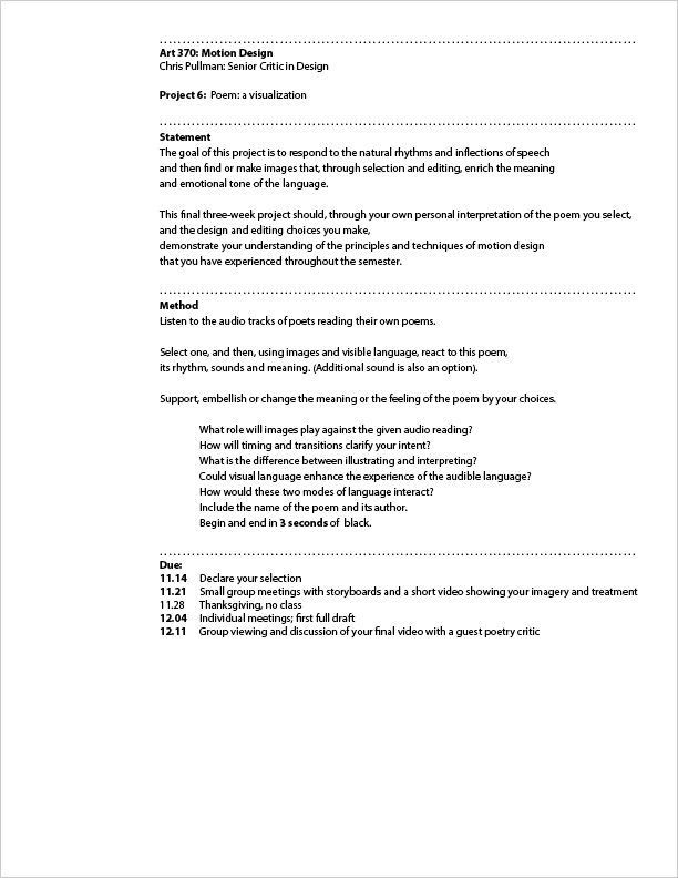
In the Graphic Design Masters Program at Yale, I currently teach motion design. The objective is to shift the designer’s thinking from “composition” (getting all the elements into just the right spot and freezing them) to “choreography” (planning the path and behavior of multiple elements within the same time space). One of the projects I assign, near the end of the semester, involves the visualization of poetry. I offer my students four or five audio files of poets reading their own poems. I ask them to listen to them all, then select one to work with. This is the prompt: The goal of this project is to respond to the natural rhythms and inflections of speech and then find or make images that, through selection and editing, enrich the meaning and emotional tone of the language. The entire project statement reads like this: I have found that this project regularly produces some of the best work in the course. Often several students work with the same text and it is fascinating to see how differently they come out. For example, the following two variations were from the same class, responding to the same poem and are among my favorite interpretations. Both of them are spare and elegant but entirely different in conception. In the first, the austere palette, apt symbolic imagery and impeccable timing electrify the intense reading and feeling of the poem. His classmate’s unexpected treatment finds in the poet’s fractured text a second message that adds a different, urgent voice. By their different choices of imagery, timing and behavior, the designers have enhanced the purely aural experience of the poem. Over the years I have tried a wide variety of poems and have been knocked out by how uniquely the ideas in the poem are interpreted, and how their meaning is shifted through the addition of specific images and their timing against the reading. Notice the radically different treatments of this poem by Sharon Olds; how a single underlying unifying visual idea is varied throughout the poem responding to the language. All three have chosen black and white. Why? I want to show a few more that demonstrate particularly strong solutions to this project. Watch how the first one uses a single live-action shot, timed perfectly to the text, and utilizing the content of the poem itself. Simple, elegant, powerful. The next finds and treats images that illuminate a segment of Tracy Smith’s poem My God, It’s Full of Stars. When is no image the perfect image? Declaration, another poem by Tracy Smith, angrily excerpts phrases from the Declaration of Independence to respond to the continuing injustices inflicted on our own people. The tough, in-you-face choreography of these words is a particularly strong treatment. And finally, dynamic text, abstract imagery and color combine to punctuate another contemporary grievance in Dana Levin”s Instructions for Stopping. Like most teachers, I am always fascinated to/ see what my students do with the provocations. The goal is to get them to th ink like choreograpers and to be comfortable using the special qualities of Time, Motion and Sound to solve the communication problems they will face during their next two years at school, and in their future practices as designers. |
