Joseph Muller-Brockmann’s Typographic Re-boot
|
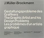
In the mid 60’s, when I was just learning about design and typography at Yale, Modernism was the style du jour. I was intellectually turned on by the minimalism (one font, usually Akzidenz in just a few sizes), the rules (flush left, ragged right, the logic of the gird) and the idea of a “universal” aesthetic where content of any variety could be accommodated in this rational system. Switzerland was then the Mecca of European Modernism and Joseph Muller-Brockmann, one if its key practitioners, had just published what might have been the first pedagogical book on the subject: The Graphic Artist and His Design Problems.
I opened it up and there on page 124 was this amazing poster from 1960. 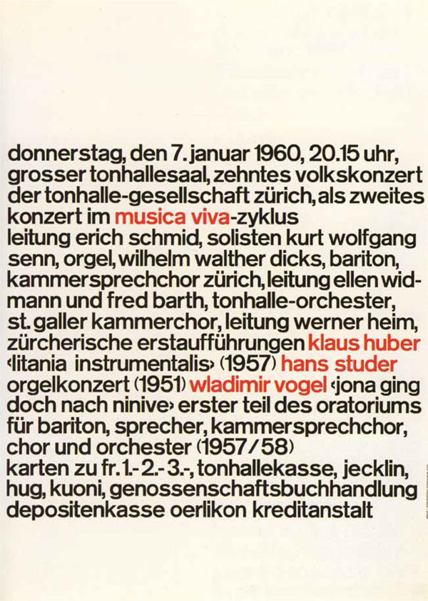 1960 I was jolted, because it seemed to me to represent the irreducible, can’t-get-more-basic-than-this exemplar of Swiss Modernism. It was as if every Swiss poster of the previous decade was reverse-engineered, gradually eliminating all pictorial elements and all hierarchical and clarifying typographic signals until the only thing left was one un-inflected, flush left, ragged right, one-size, one weight, run-on block of text. And then, into this dense message, the bare minimum of clarity was added: commas between phrases; a faint hint that it contained three paragraphs; and then those four red pairs denoting the content: the name of the concert series and the three performers. Gone are Muller-Brockmann’s geometric illustrations and iconic photographic images of the 50’s. 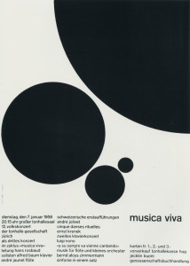 1958 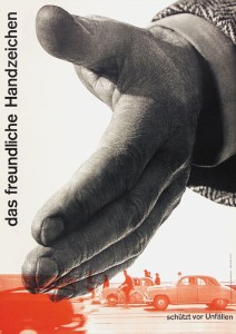 1955 From this baseline, type-as-image-re-boot, sprang a series of beguiling and increasingly complex, but at the same time more legible, typographic compositions for Musica Viva. 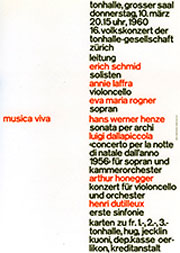 1960 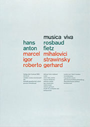 1962 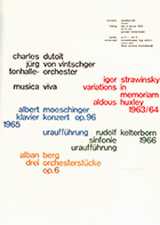 1968 For me this deliberate process of moving from simple/un-inflected/opaque, to complex/articulated/clear, informed my own early typography as a teacher and encouraged me in my own work to see typography itself as an image.
I Heart Design
|
